Technical debt: at the start of game development, you need to get things working quickly. This means writing simple code. You don't know what the large-scale shape of the code will be yet. You don't know what different parts of the code will have in common. Which means that creating abstractions too early is just as bad as optimising too early.
Airships has a concept of screens, of which there is one active at a time. The main menu is a screen, so is combat and game setup. Each screen does two things: update and draw. In the update phase, it gets told how many milliseconds have passed since the last update and what user input is, and changes the game state accordingly. For example, if the user has clicked on a button, the result of that click is processed in the update phase. During the draw phase, the screen is given a graphics context and uses that to draw itself. (Here's an article I wrote that goes into more detail on this.)
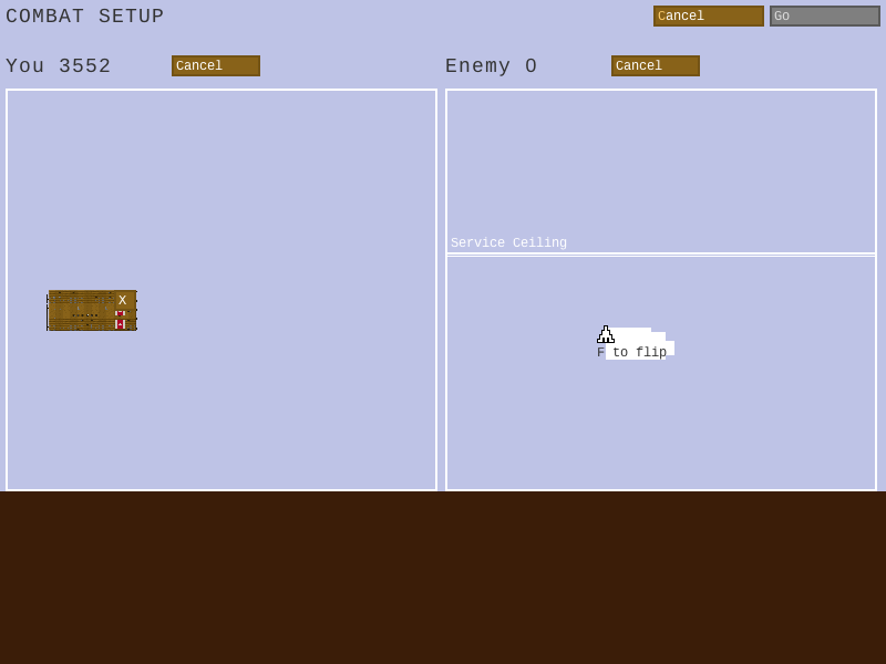
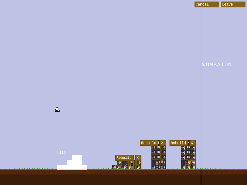
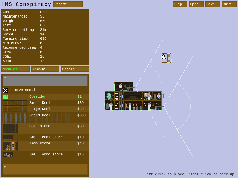
At this point in development, a problem has arisen: there's a whole bunch of screens that do very similar things: the combat screen, setup screen, defences screen, and ship editor. All of them draw ships against a background and allow the user to manipulate the ships and scroll around. They also segue into one another: the setup into combat, and the defences into the editor.
Each of them is a completely separate code base, with similar but not identical code for things like drawing ships. There are also annoying differences, such as zooming. It works differently in the combat and ship editor, and the other two screens don't have a zoom feature, even though it'd be really useful. I could also implement zooming in the setup and defences screen, but this would be even more duplicate code!
(Near-)duplicate code is very bad: it means more work when I want to change things, and it also leads to subtle inconsistencies that make the game feel unpolished.
So I decided to reorganise: Now I know what the different screens have in common, I can build a useful abstraction. All four screens are being merged into the UniScreen! Instead of being a monolith that contains all the code for updating and drawing, the UniScreen consists of a bunch of different components that update and draw depending on the mode the screen is in. The components are organised into a number of types:
- Intent: What the screen is actually for, right now: setting up before a combat, fighting, editing ships, laying out defences. There is always exactly one intent, and it can be changed without replacing the screen, which means seamless transitions.
- Tool: Takes care of what happens when you click on the screen, basically. Used for selecting and moving ships, adding modules, etc. Again, there is only one tool active at any one time.

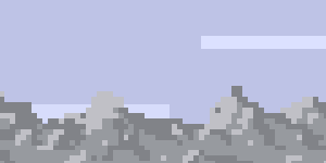
- Graphical Layer: Draws clouds, birds, mountains, etc. Takes zoom and scroll into account.
- Button: Each button component describes one button, e.g. "Surrender" or "Add Building". Active buttons are laid out automatically.

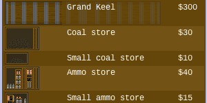
- Info Panels: Things like the palette of modules.
The UniScreen does take care of drawing the ships - the one bit of work that's common to everything and is hence not delegated to a subcomponent. It does call two kinds of component for each ship:
- Overlay: Zoomed and scrolled, used to highlight bits of the ship. For example, which modules are inaccessible, or a yellow border around the currently selected ship.
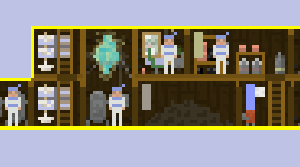
- Chrome: Not zoomed. Used for buttons and text relating to a ship, which should stay the same size no matter the zoom level.
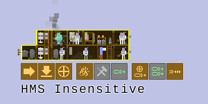
I'm part of the way there with this reorg. Single combat setup and combat work, and feel a lot nicer than before. There's still a lot of components to add and details to work out, but I'm very pleased with how it's going.
I couldn't have done this right from the start, because I didn't know that these were the commonalities and differences I needed to take into account. So next time I'm writing a game, I'm likely to go back to the much simpler "vertical silos" of screens, and wait to see what abstractions present themselves this time.
On the other hand, now that I have created this system, I can see the next level of abstraction. What differentiates the various types of components is four things:
- Is it scaled to the world? (tool, graphical layer, ship overlay)
- Is it positioned relative to the world? (tool, graphical layer, ship overlay, ship chrome)
- One or many? (one: intent, tool)
- Is it laid out by the UniScreen? (yes: buttons)
You could abstract this further and have generic components that indicate these four bits of information. At this point the system is arguably generic enough that you might as well start from it. But if it turns out not to serve the game you're writing, you're in trouble. It's much harder to change a complex system than a simple one.
For now, I'm very happy that I took this path, and at the end of the reorganisation, the UniScreen will be a great base to continue building the game on.

