Now, doing this properly would involve tracking the position and intensity of each light source, but this would be very slow, as the number of lights can be in the dozens or hundreds, and each pixel drawn would have to do distance and angle calculations for each of them.
Instead, I stuck to the light map concept, but with four light maps, one for each cardinal direction. A single point light now draws a cone of light onto each of these maps:
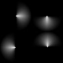
This tells us where the light is coming from at each position on the screen. We also need to know the direction the objects on screen are facing. So we introduce a bump or normal map: a secondary sprite sheet that indicates the angle of surfaces. Each color channel in the sheet stores part of the information - in the case of Airships, the red channel stores up/down angle, green stores left/right angle, and blue stores the intensity - the "shinyness" of the item.
Here's an example of the three color channels on a targeting computer, and the sprite overlaid with the channels:
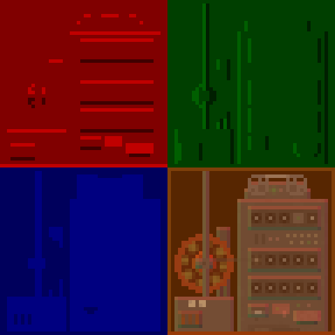
As you can see, it basically looks as if it's being lit by a green light from the left and red one from the top.
To calculate the total light intensity at a location, the shader now first looks up the surface angle. Then, for each directional light map, it looks up the light intensity. Combining the information about where the light is coming from and where the surface is facing gives us the end result:
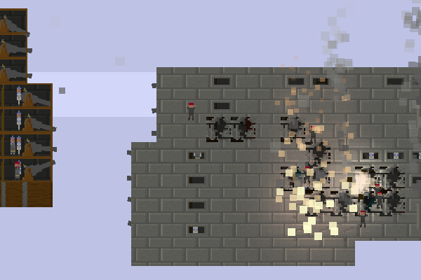
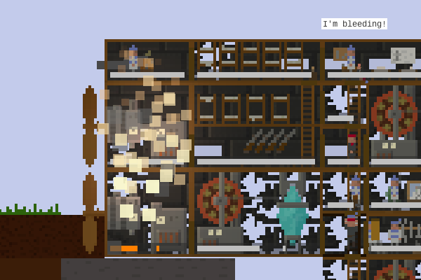
In the previous post, I mentioned that this new lighting system was going to have a performance cost: this more complex system definitely costs performance, though I was able to reduce the cost by downsampling the light map 8x with no visible difference. One of the things left to do is adding a setting to disable the clever lighting stuff for better performance.
So what else is left? Lots of mop-up: fiddling with the colour values, adding more particles to places, overriding the normal bump values at the edge of armour so ships are lit from the side:
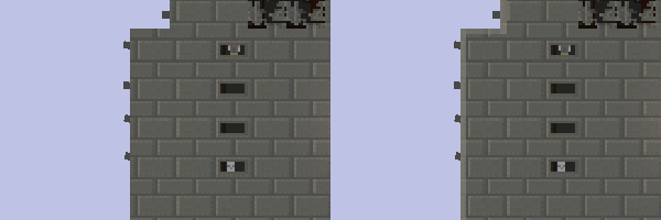
Finally, doing lighting on crew body parts and gun barrels, which can rotate arbitrarily and need a slightly cleverer shader that takes this into account. That will conclude one of the major parts of the next version of Airships, with the new user interface still to come.
Oh, and you should vote for Airships as the IndieDB Game of the Year 2014.
