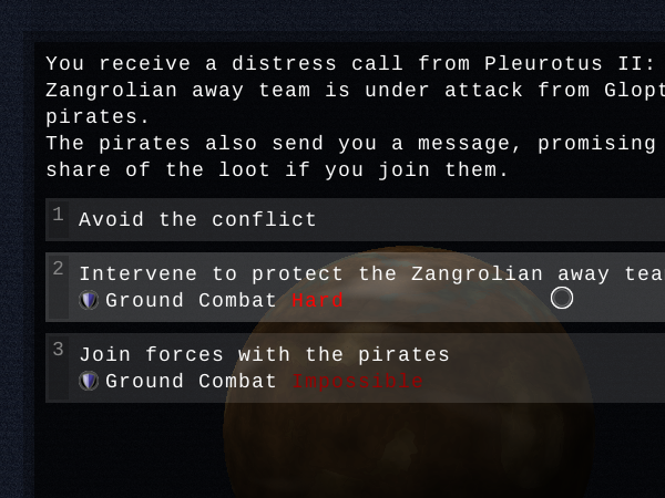
In this encounter, you have three choices: avoiding the fight, or joining in on either side. The game tells you your odds - because you don't have any decent personal weapons or security crew, the odds in both cases are bad.
Your choices can also influence crew morale: if you had a volatile idealist on board, siding with the pirates would make them unhappy. The game will warn you of this, and with choices where a bad outcome means the instant irrevocable death of a crew member, it will put up a nice big red warning. This is perhaps the biggest change compared to earlier versions: the game now does its best to give you an idea of your chances.
Beyond this encounter view, the left quarter of the screen will contain ship information: your crew and their skills, your equipment and its bonuses, cargo, blueprints, etc. So the basic layout of the old version will remain, since that works well enough, but it's just all going to be much more polished.
The next thing I'm going to put into this new pretty interface is skill checks: when you select a choice that requires you to succeed at e.g. Ground Combat, the choice button will expand and turn into a very short animation at the end of which you can see whether you made it. Once that's in, the game will be just about playable using the new interface.
So far, I'm pretty pleased with my progress on the new UI. There's still a lot to do, and it will definitely need performance optimization, but I think it's looking good.
Next update, I'll do a feature on some of the game's background: maybe some history, or the skill system, or the ship you'll be flying, or one of the alien species.